One aspect of an effective graphic design is the right choice of typography. Getting it right with your typography is the first step towards making an image stands out and achieves a great overall design. Conversely, choosing the wrong typography is the fastest way to ruin your design and appear amateurish, even though you have the skills and experience of a pro. Due to the importance of fonts in graphics design, we have compiled a list of the top fonts in graphic design that every designer should know about and learn how to and when to use. They are the following.
Eames Black Stencil
If you are a designer who does a lot of stencil work, this is one of the top graphic design fonts you will ever come across. Eames Black stencil font is part of the broader Eames font family, and it was the work of the late Ray and Charles Eames. Looking keenly at the font, you will notice it having some unique and nicely designed curves. These were inspired by the curvature usually made of bent plywood.
Otto Font
The Otto font is another top font with heavy application in graphics designs. It features a combination of delicate lines graced with flashes of block colors. The Otto font is a unique display font with two distinct personalities, and this is the font you should fall in love with if you do a lot of large formats.

Poster Bodoni
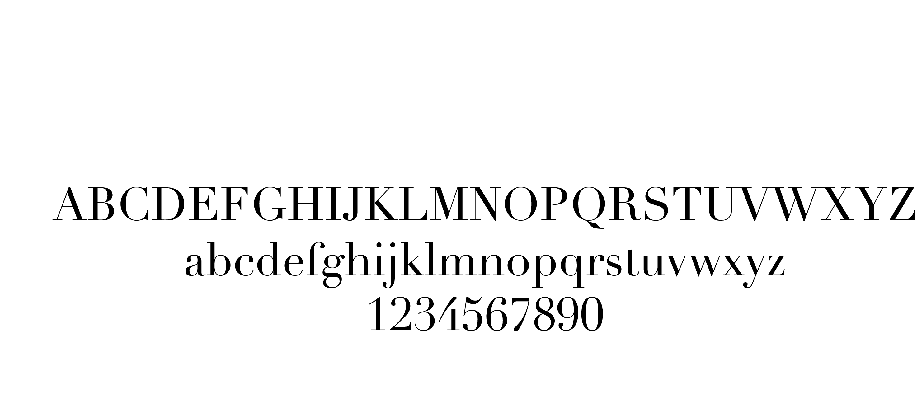
Vignelli started the Bodoni range of fonts as well as the classy Didone fonts, but it seems that these were not enough for the skilled artist since he wanted something that could offer a strong contrast. This led to the development of Poster Bodoni font, whose versatility in applications has made it be one of the most revered and top fonts in graphics design. This is a must have font for every designer keen on having a few selected fonts that can be used for a wide variety of applications and where distinct contrast is required. Poster Bodoni simply has the versatility to do that.

Cumulus & Foam
Cumulus & Foam font is the work of Stefan Kjartansson. It is an utterly unique font, with exquisite display of simple and ultra thin lines reminiscent of the clouds known as cumulus. It has been described by many typographers as “the most beautifully grotesque font you will ever come across in the present times.” Though the creators assert that it doesn’t fit the definition of a typeface, one fact remains that it can add style, character and order in any design in which it has been used. This is another top font in graphic design you should keep handy for those fancy design projects you normally come across.
Linotype Didot
Linotype Didot is another alternative to Bodoni and they were developed around the same period way back in the 18th century. It has the characteristics of sharp and seductive serif as well as sharp angles, but it comes with more spaces for a font with its weight. If you are well conversant with the Bodoni font family, then the Linotype Didot will appear to you like a slimmer version of the Bodoni. This is the font you want to be using if you need to add a classic and timeless elegance to your graphic design works.

Mrs. Eaves
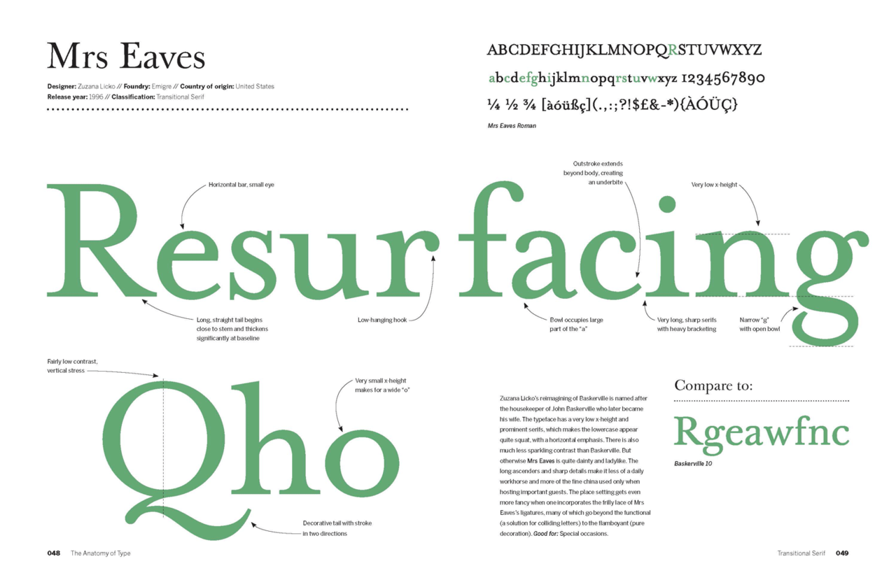
If you have seen the WordPress logotype, then you have seen Mrs. Eaves font in action. It is among the top fonts in graphic design with the versatility and the timeless beauty adored by many graphic designers. The font was designed in 1996 by Zuzana Licko and named after Sarah Eaves, the designer’s housekeeper whom later became his wife. The fact that the font was adopted in creating the WordPress Logotype is a clear indication that it is indeed one of the top fonts in graphics design at the present times.

Bembo Font
Bembo came into existence way back in 1929, and it is viewed as the incarnation of an old-style serif originally developed in the 15th century. Bembo font has been regarded as not just one of the top fonts in graphics design but also one of the best fonts for setting book copy. Its stylish Italic ampersand makes it a suitable font for expressing authentic and formal beauty in design.

Modern 20
The Modern 20 font was designed by Stephenson Blake. It offers excellent typographical shorthand for designers interested in having refinement and quality in their works. The font is heralded among the top fonts in graphics design since it is the commonly used typeface in the world for headlines. Its adoption in the Pentagram logotype is another indication on how powerful and adored this font is.
These are just but a few of the top fonts in graphics design. If you want to become a prolific graphics designer, you should have most, if not all of these fonts in your design arsenal so that you can have the versatility and flexibility to move from one great font to another with a lot of ease.
Avoid these color combinations in your designs!
 LogoMaven | Easy Logo Design Software & Logo Maker LogoMaven – Easiest way to learn logo design!
