 LogoMaven | Easy Logo Design Software & Logo Maker LogoMaven – Easiest way to learn logo design!
Top 6 US Presidential Campaign Logos in History
Can a custom presidential campaign logo affect the history of a nation? Many didn’t think so a while back, but the use of logos in presidential campaigns in the United States has just confirmed the power of logos in winning elections. Most recent one is the exquisite campaign logo for President Barrack Obama, which was hailed to have been extremely instrumental in his campaigns and ultimate election as the President of the United States of America.
Whereas a logo alone is not sufficient to win a presidential election, its role in the Obama campaign can no longer be ignored by presidential hopefuls. Here we take a look at the top US presidential campaign logos and the various roles they played during the presidential campaigns-:
Obama 2008 Logo Design
Barrack Obama’s winning slogan for the 2008 presidential elections was “Yes We Can”. This necessitated the creation of an inclusive custom logo using the letter “O”. The design was even more appropriate since apart from the inclusivity of the circle, it also indicated the first letter of Barrack’s last name.
On the design aspects of the logo, it has red and white stripes with the letter O rising from behind reminiscent of the American sunrise. It represented a new dawn for Americans who had many challenges as a nation back then. This logo was taunted as the best ever to be designed in the country’s election history and it has acted as a prototype for many politicians, not only in the United States but other countries in the world as well.

Bush Logo Design
The Bush logo design for the 2000 and 2004 presidential elections is also considered as one of the best presidential campaign logo designs in the history of the United States. The custom logo had deep military style color blue and this acted to represent one of the pillars of the Bush administration: the military prowess of the USA and the continued war in Iraq.
It also had the flag of the United States towards the very end appearing unfurled as if dancing in the wind during a breezy day. Also admirable about the Bush presidential campaign logo was the use of bold and readable fonts that made the logo more visible hence easily recognizable by many.

Clinton 1996 Campaign Logo
The Clinton presidential logo of 1996 used the dominant colors of the flag of the United States of America: red and blue heavily. With the deeper tones of these colors, the Clinton logo was very endearing, yet exuded simplicity and boldness in design. It had bold, news-like fonts which gave a hard line to a personality that was otherwise known as a softie.
The logo had no special images or icons and only used the name of the presidential candidate and the running mate, not even with anything to give an indication of the beliefs of the candidates. Nonetheless, the logo captivated the imagination of most Americans with the use of the flag colors and it successfully managed to inspire the people to beyond the scandals that plagued the administration during that time.

Reagan 1980 Logo Design
The Reagan presidential campaign logo in 1980 featured a bold and a patriotic image in the design. He used blocked sans serif lettering which stood out conspicuously on a white background improving the simplicity and the legibility of the logo.
Reagan decided to use a strong and a more traditional image of an elephant to pass the message to the American people that he was going to be more aggressive than his predecessor. This not only worked well for the design but also made the electorates have more faith and confidence in him, thus contributing to his win during the elections.

Hillary Clinton Campaign Logo
After the Obama presidential campaign logo, Hillary Clinton’s bid for the top seat in 2016 has also seen the country see perfection in the design of presidential campaign logos. The Clinton’s campaign logo is nothing fancy but a simple letter H with a forward looking arrow. The logo uses only two colors: red and blue.
This logo displays deep originality, which is lacking in almost all the other prudential campaign logos. It is a perfect demonstration of minimalism and versatility in design. It is also loaded with secret meanings: The letter H signifies the name of the presidential candidate while the forward looking arrow is an indication that Hillary Clinton intends to take the country forward. Finally, the blue and red colors are colors of American flag hence a show of patriotism.

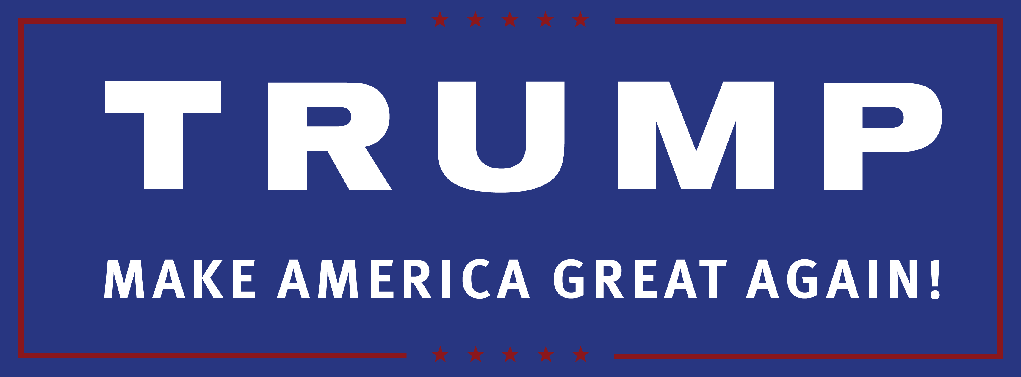
Donald Trump Campaign Logo
The real estate mogul turned presidential aspirant has done a great job in the design of his presidential campaign logo. It is a simple and elegant design displaying all the desired features for minimalist logo design. The font, as well as the use of words, is also spot on as he tries to re-ignite the American passion for greatness by urging everyone to join him in making America great one more time.
How many fonts are too many in a logo design?
